Primary
#634389 Mohamed Design
Case study / Brand Identity · 2023 · Egypt
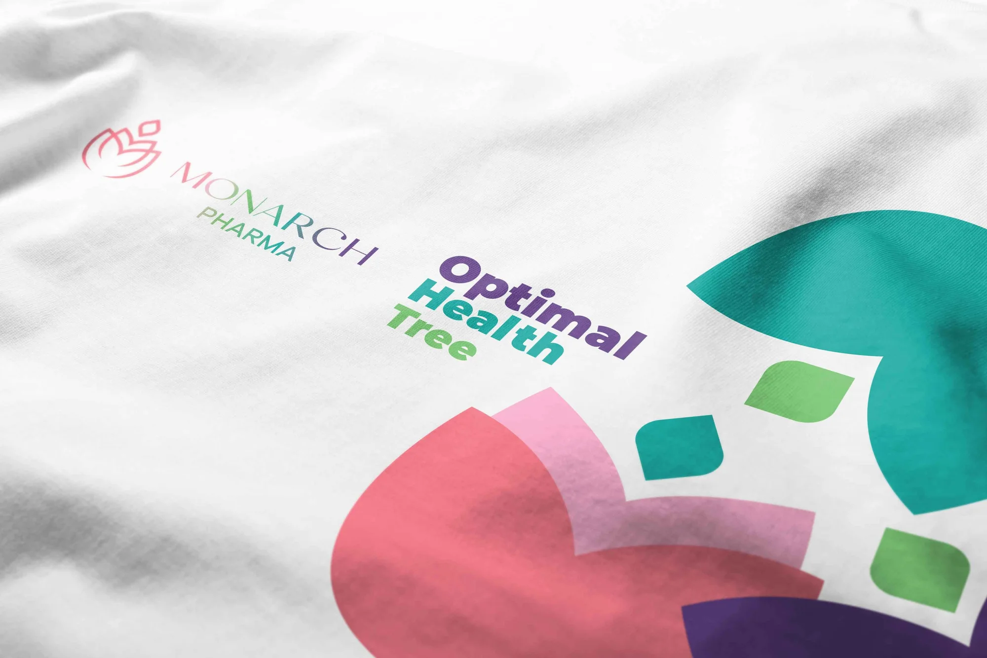
A structured, premium visual identity for Monarch, designed to communicate strength, trust and product credibility within the competitive supplements market.
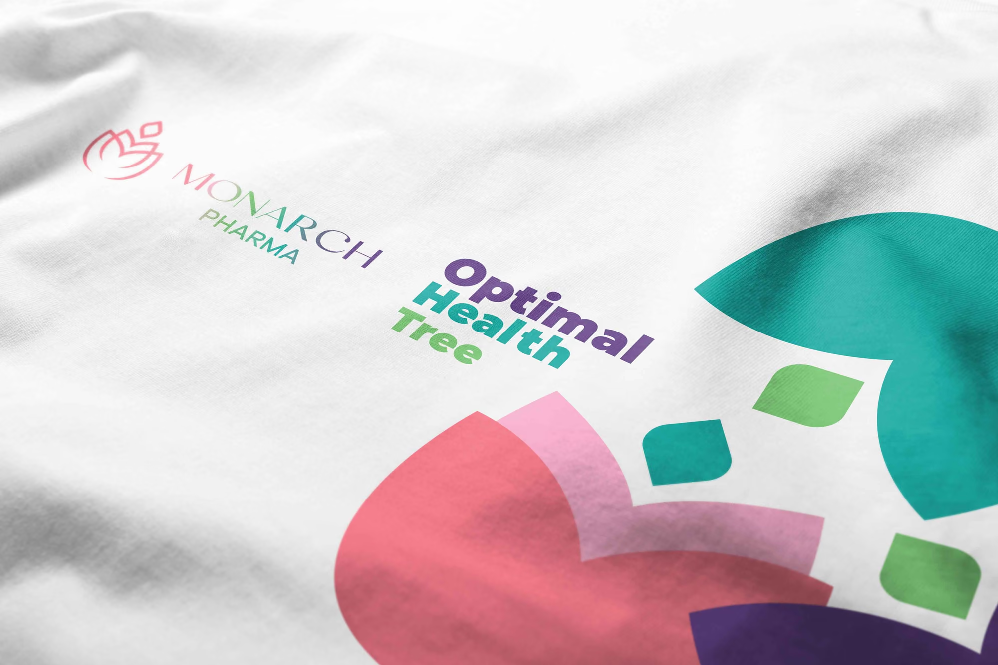
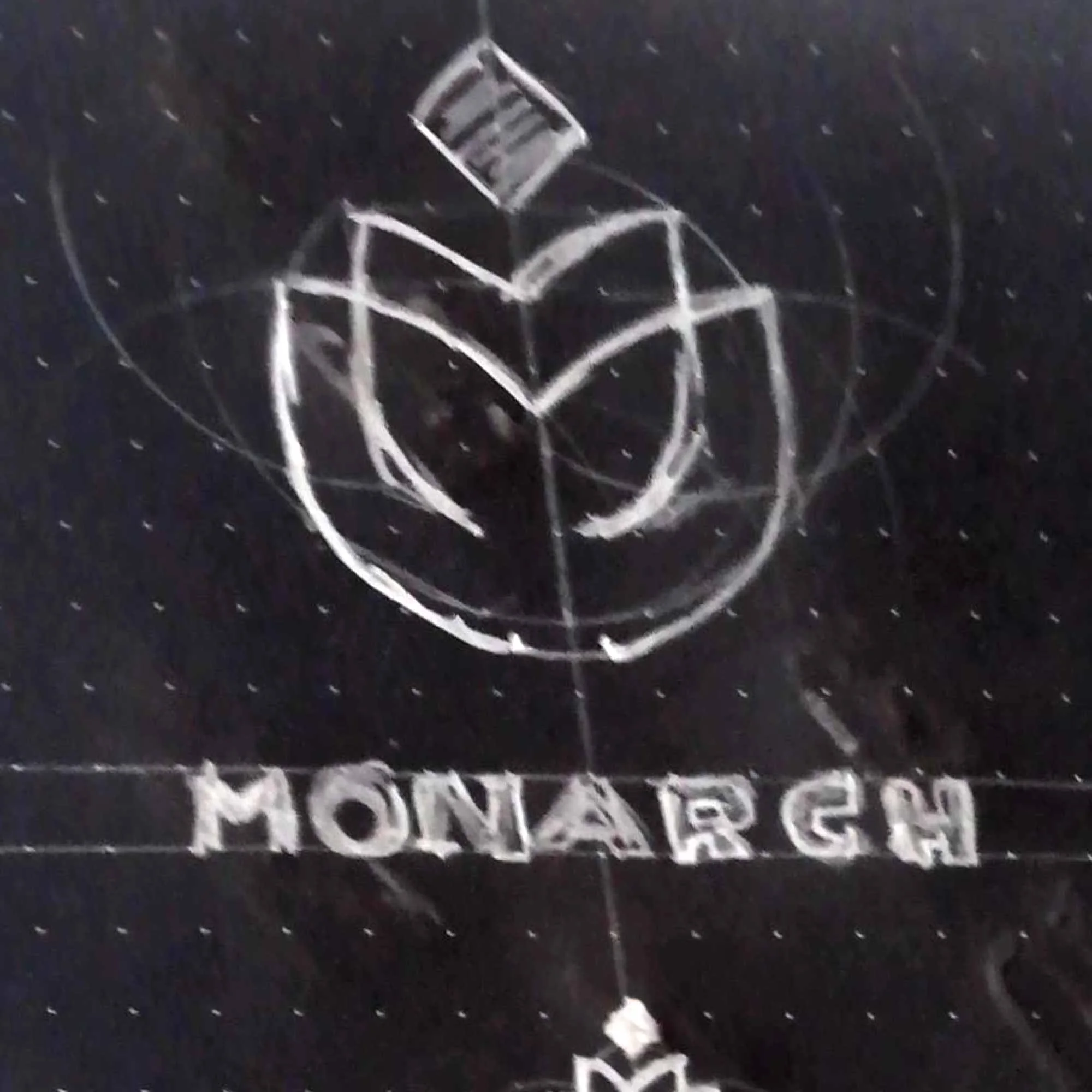
The supplements category is crowded with aggressive claims, dense packaging and visual systems competing for attention.
Monarch needed a more distinctive and professional presence — one capable of communicating quality and confidence without relying on the visual noise common across the category.
The challenge was not simply to look premium.
It was to make the brand feel credible.
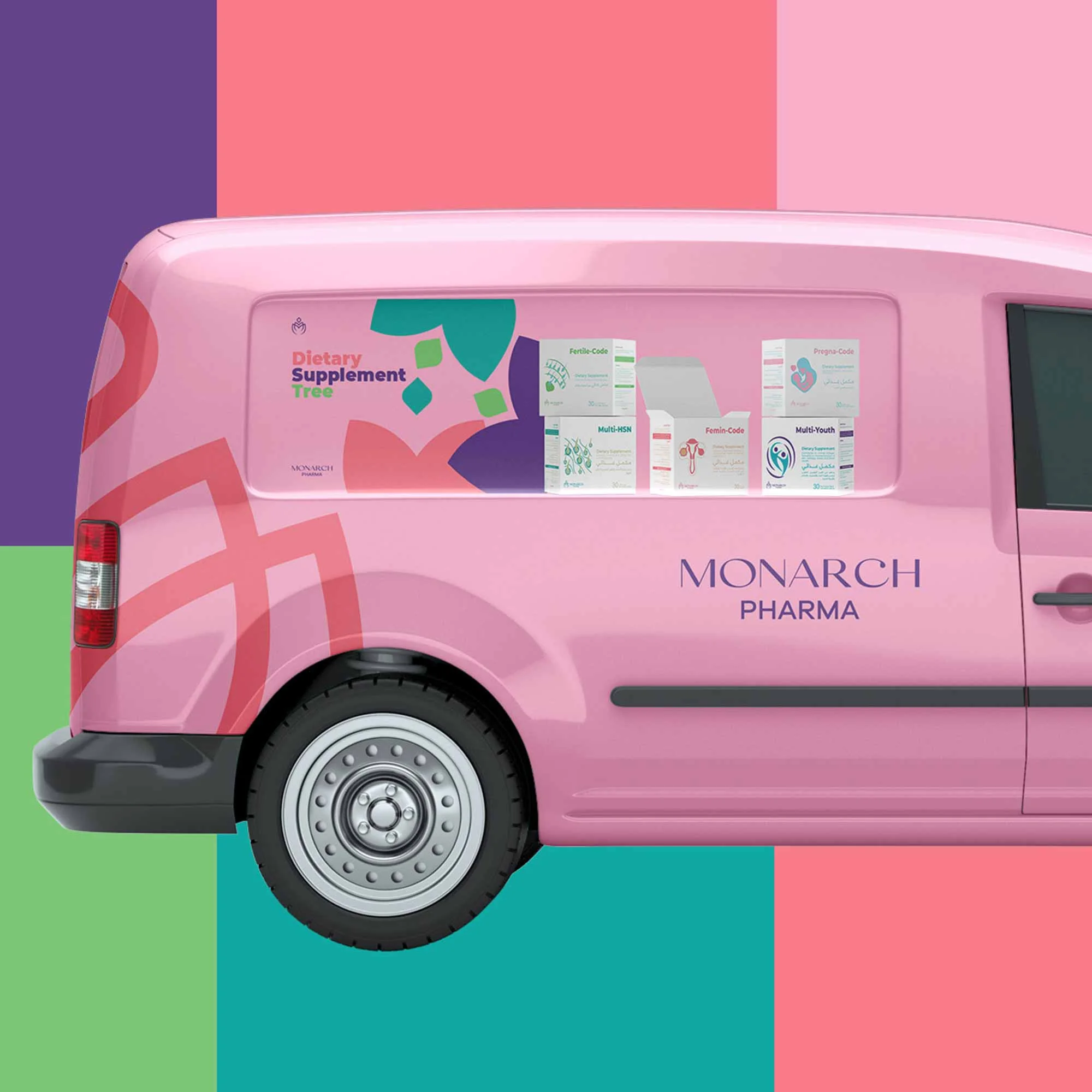
The identity was built around a simple principle: strength does not need to shout.
A clean and structured visual language gives Monarch a sense of confidence and control, allowing the brand to communicate authority through clarity rather than decoration.
The result is a visual presence that feels premium, deliberate and dependable — qualities directly connected to the trust required in a health-focused category.

The system uses disciplined composition, controlled typography and a restrained visual hierarchy to create a consistent premium presence.
Rather than filling every available space, the identity uses simplicity strategically.
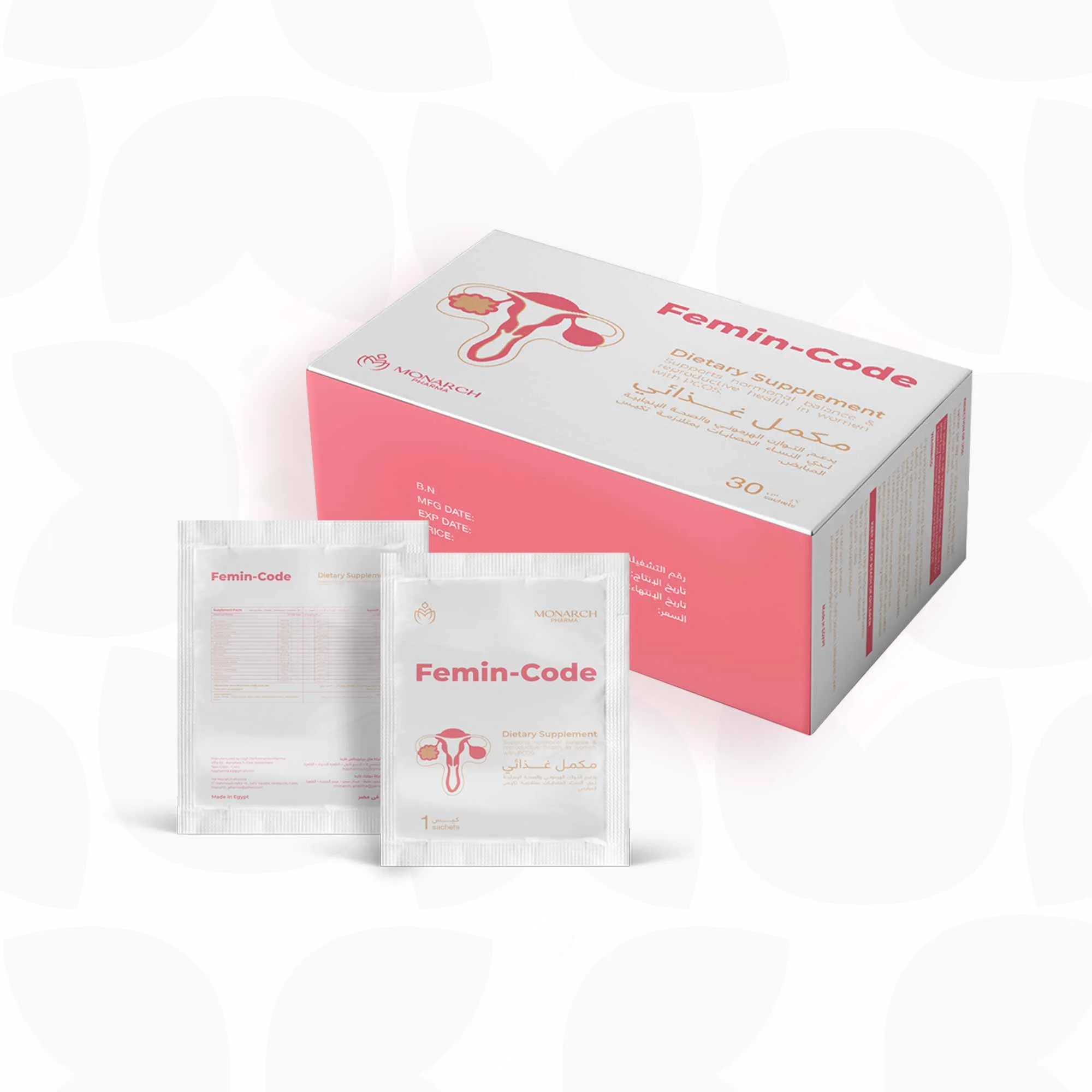
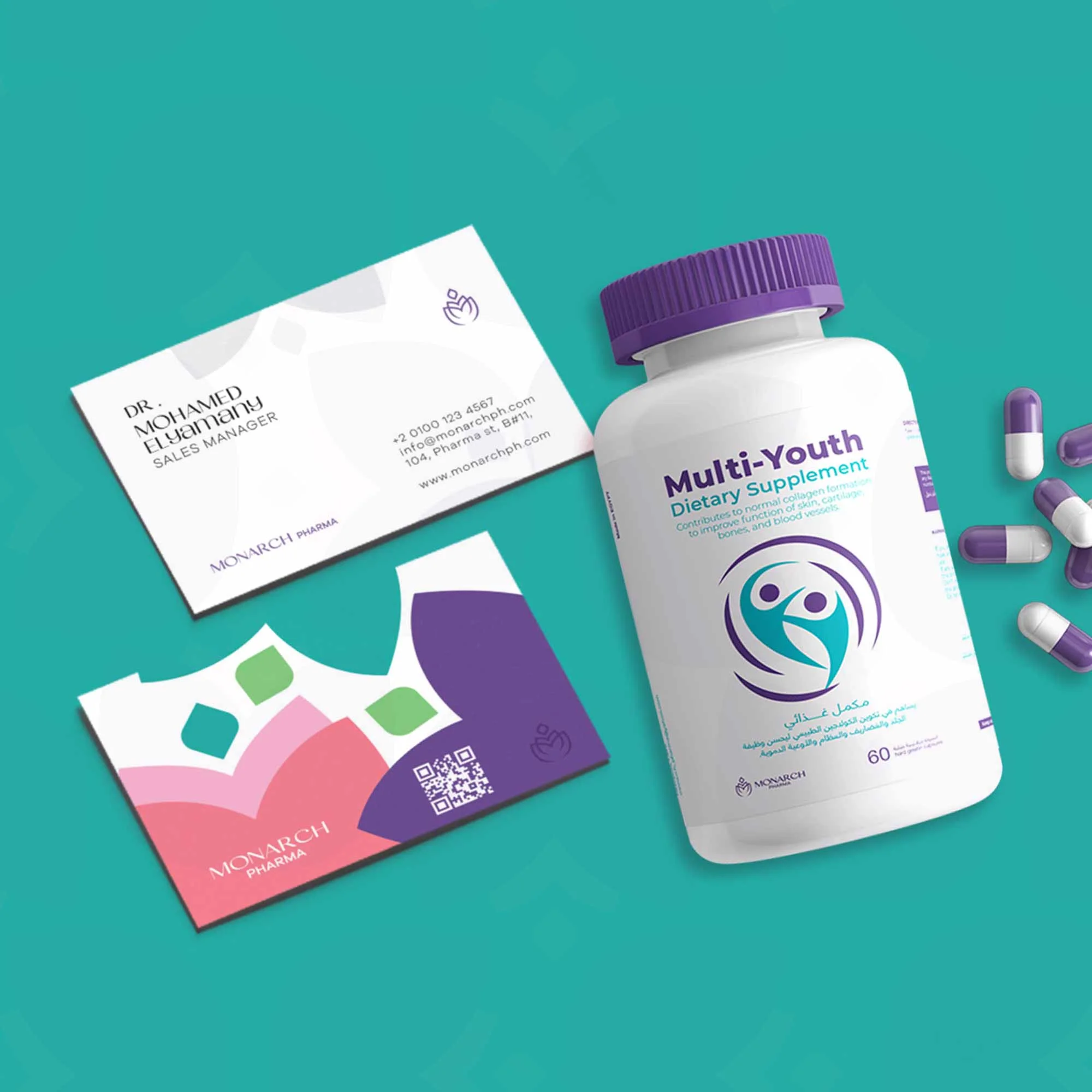
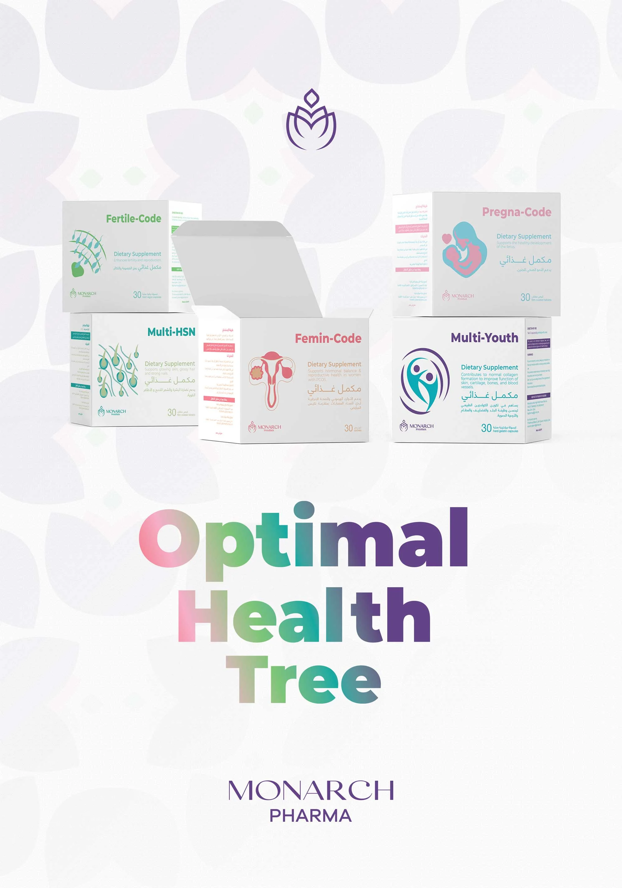
Clear information architecture allows products and communication to remain easy to navigate, while the overall visual language reinforces the same sense of quality and confidence across every touchpoint.
The brand feels stronger because nothing unnecessary is competing for attention.
Premium isn’t about adding more. It’s about removing everything that weakens the signal.Mohamed, Brand Designer
The final identity gives Monarch a more distinctive and professional brand face suited to a product-driven business.
Its structured system creates consistency across packaging and communication while positioning the brand with greater confidence and perceived quality.
The result is a scalable identity built not simply to attract attention, but to turn clarity into credibility.
---