 Mohamed Design
Case study / Brand Identity · 2022 · EGYPT
Let Me In — Creativity Made Easy
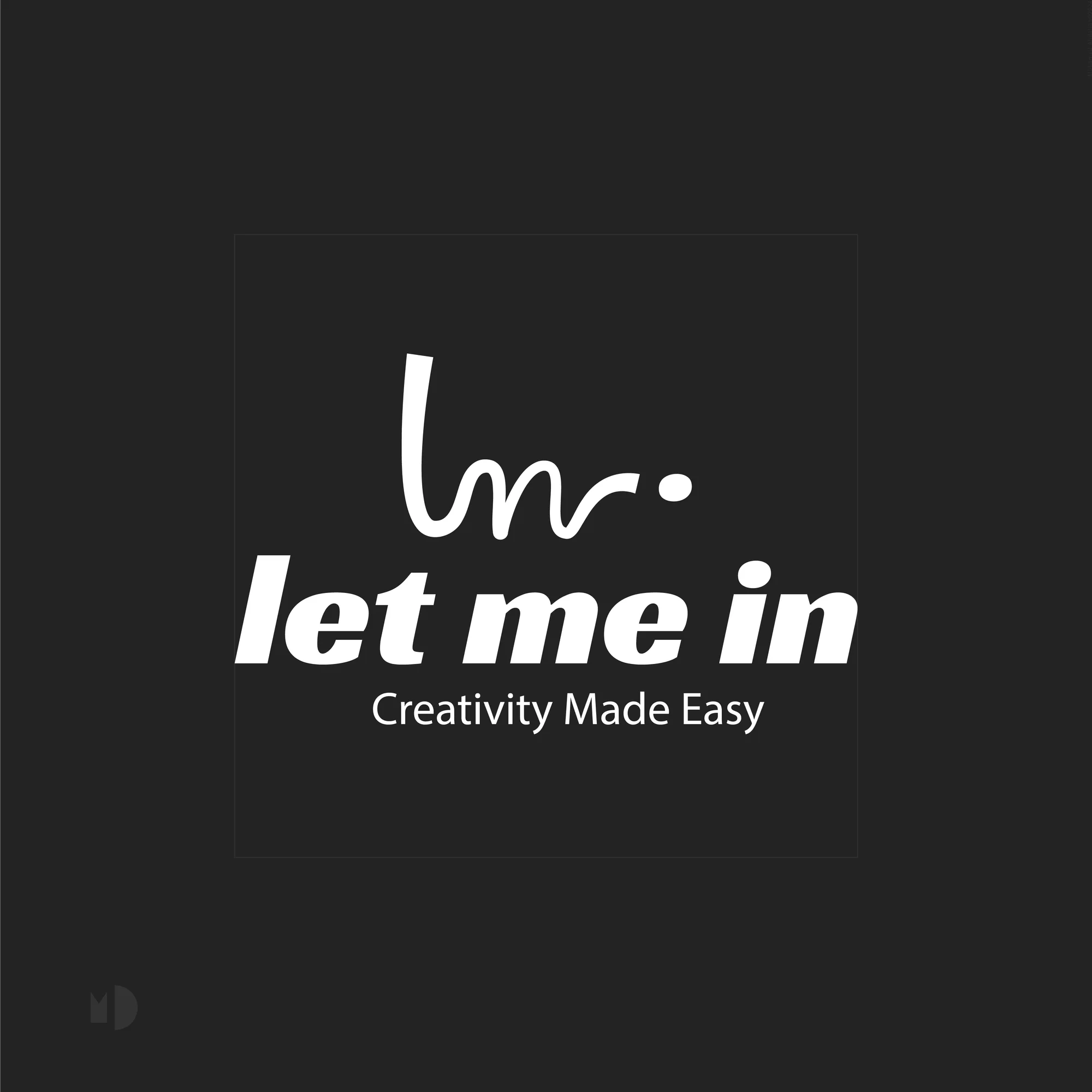
A playful, accessible identity for Let Me In, built around the idea of opening the door to creativity and making creative participation feel easier and more inviting.
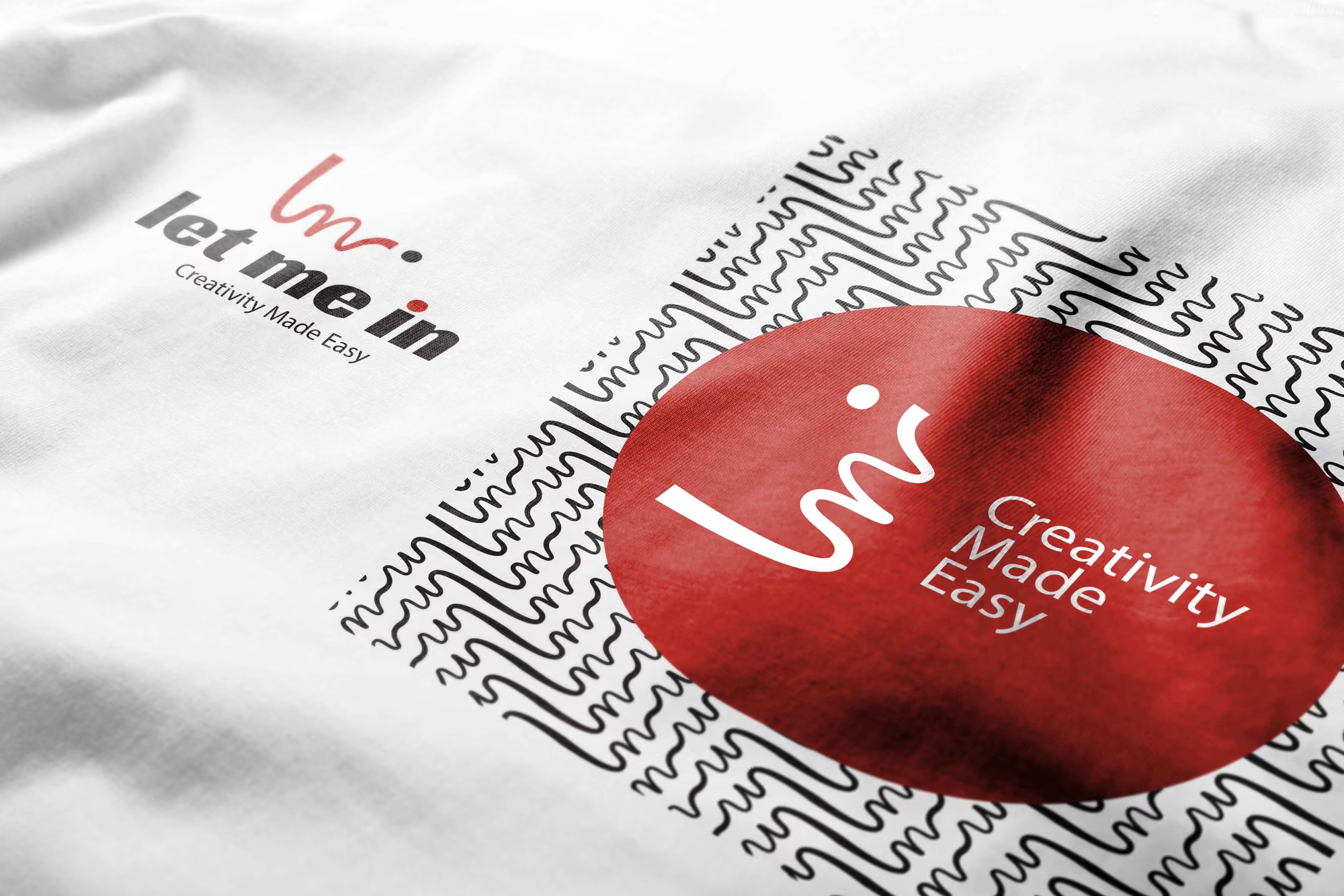
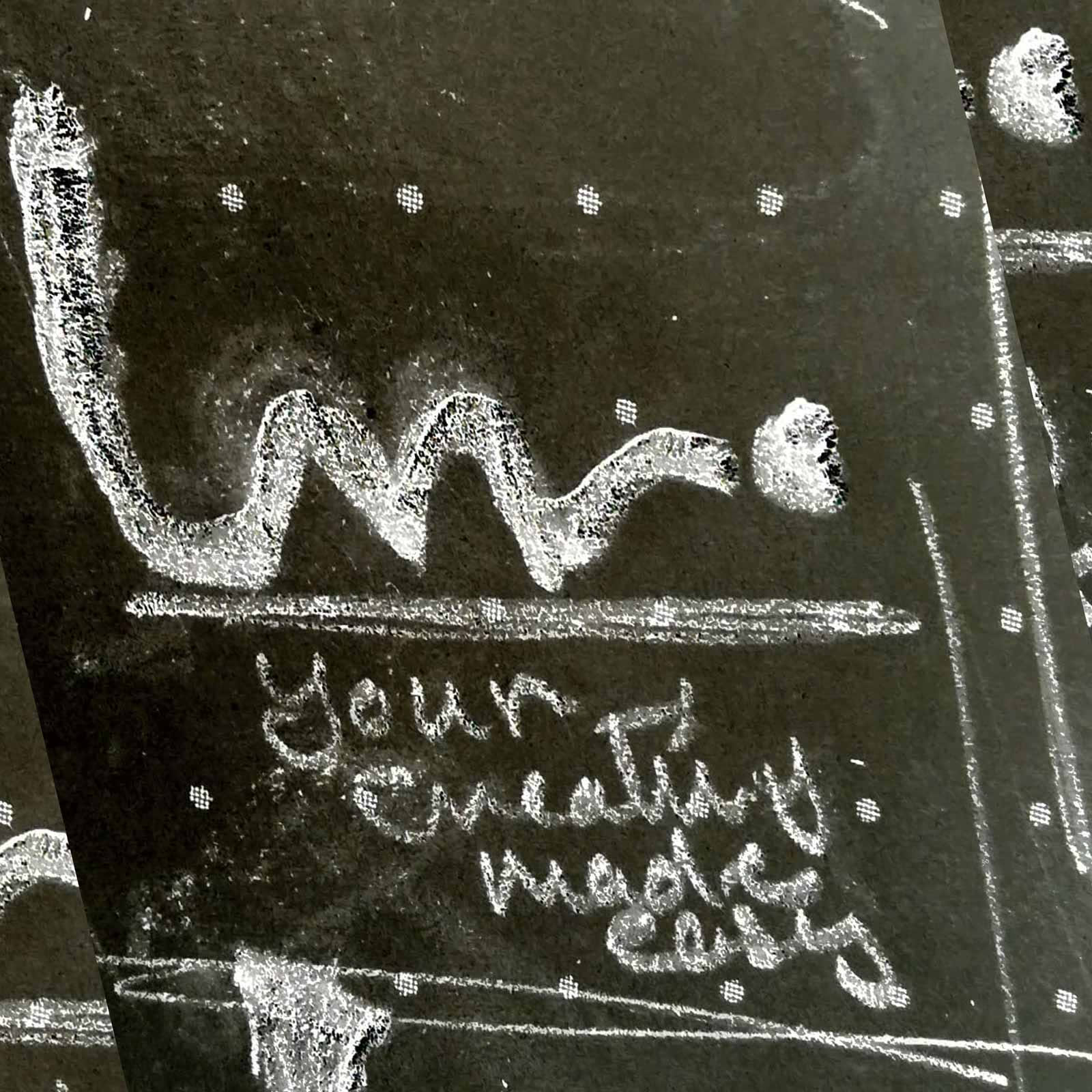
Creativity can feel harder than it should.
Creative services are often presented with language and visuals that make the process appear more complex, exclusive or intimidating than necessary.
Let Me In needed the opposite.
The brand had to feel open, easy to approach and immediately understandable.
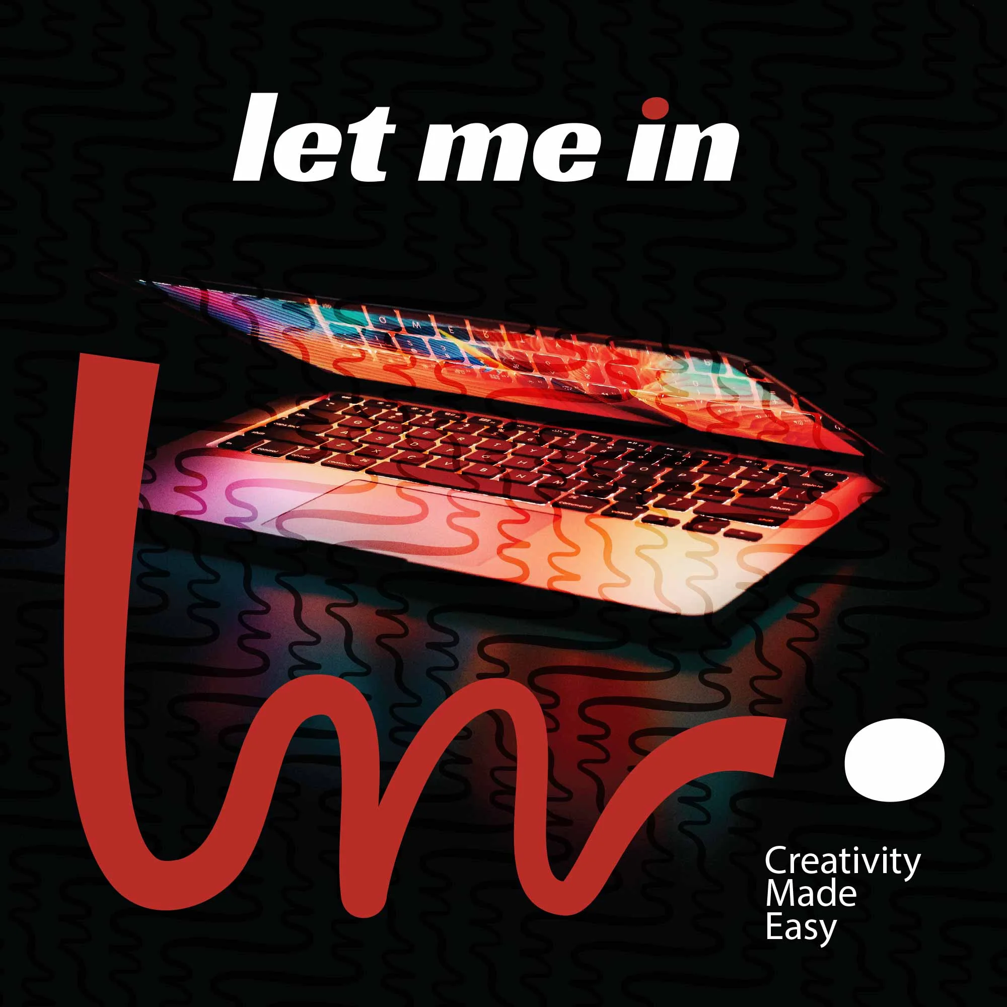
An invitation into creativity.
The name itself behaves like a request for access.
The identity turns that into a visual attitude: informal, direct and open.
The handwritten-style symbol adds a human gesture, while the bold italic wordmark creates energy and forward movement.
Together, they make the brand feel less like a formal creative institution and more like an invitation to participate.
Easy does not mean generic.
The visual language uses a deliberate contrast between expressive handwriting and strong typography.
This gives the identity personality without making it visually complicated.
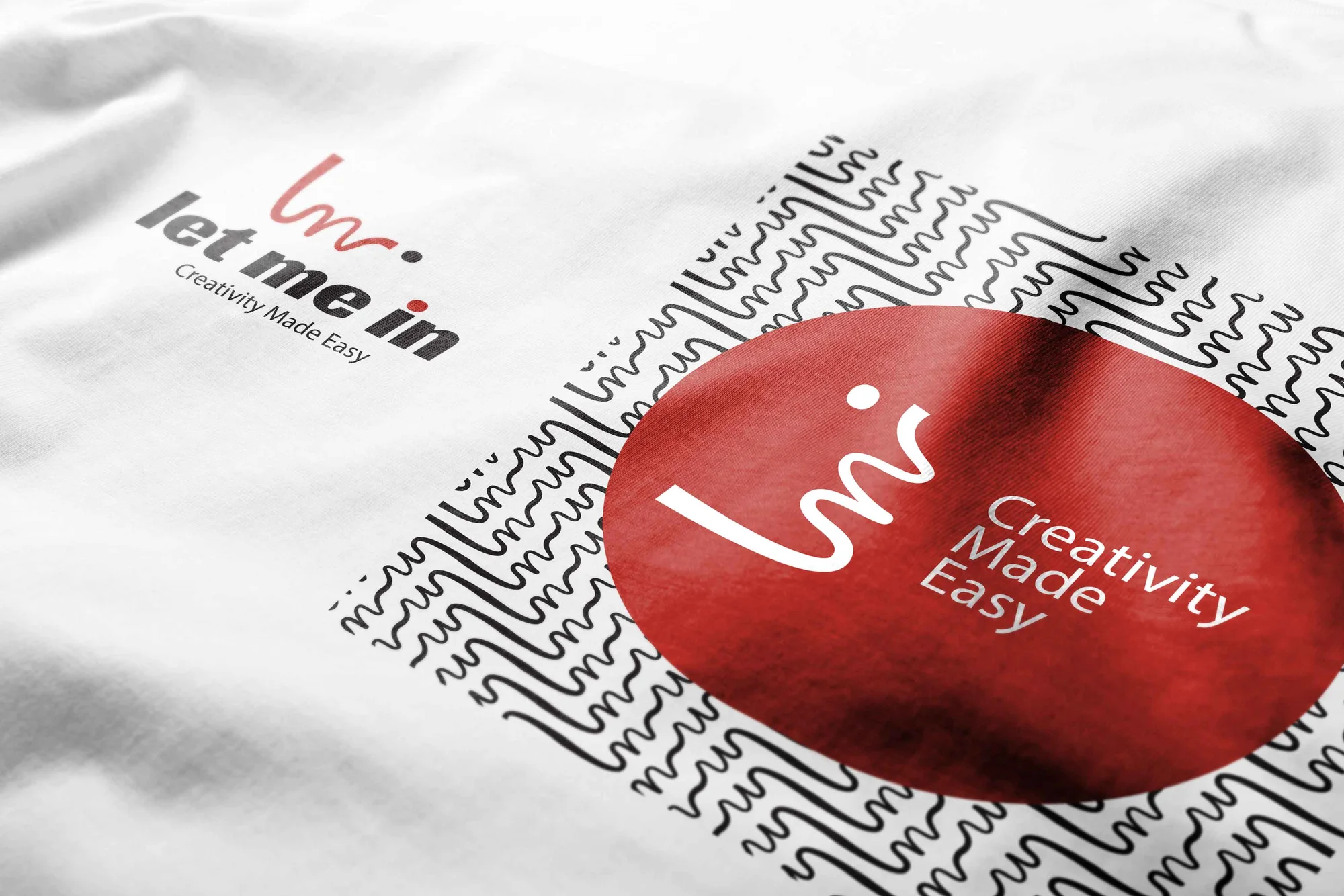
The system remains clear enough for digital use while carrying enough character to stand out across communication.
A lower barrier to creativity.
The final identity gives Let Me In an approachable, energetic presence that makes the brand feel accessible from the first interaction.
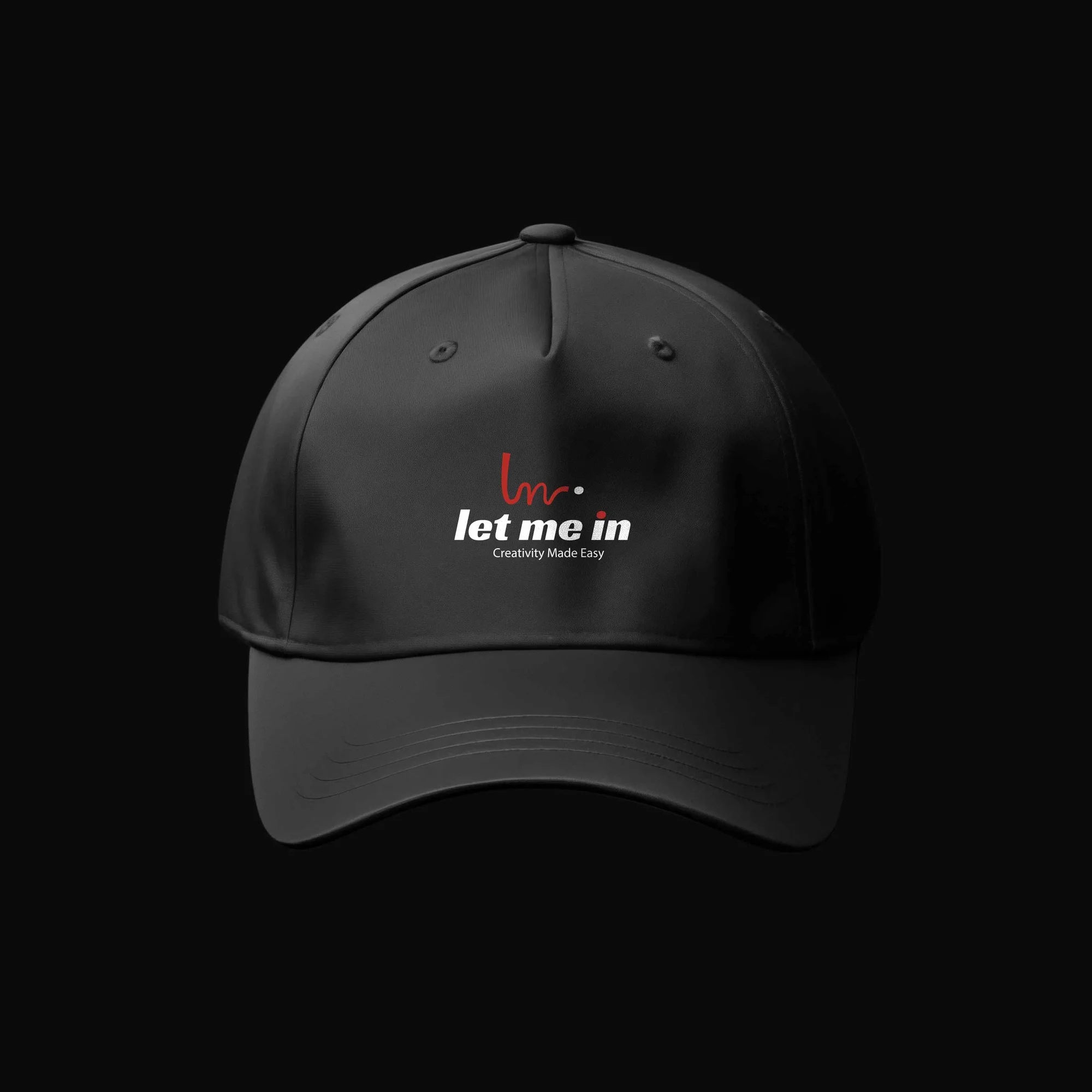
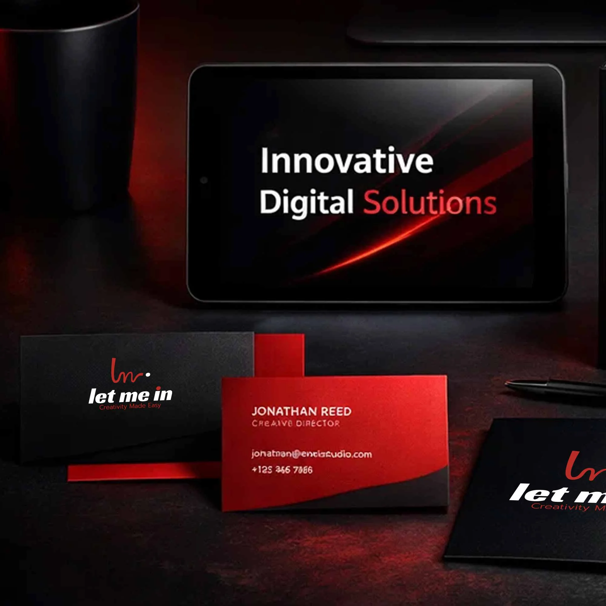
Its simplicity supports flexible use across digital and print touchpoints while the expressive logo prevents that simplicity from becoming anonymous.
The result is a creative brand that feels open by design.
---
The best creative invitation is the one that makes starting feel easy.Mohamed, Brand Designer